
It’s time to introduce another new tool in the Sentiment Matters Toolbox.
Over the past few years, I have built a broad suite of sentiment-analysis tools:
- The Sentiment Dashboard
- Sentiment Heatmaps
- Sentiment + Momentum maps
- The Buy-Side Sentiment Tracker
- Chart Packs
- Indicator Intelligence
They serve different purposes.
Some provide a broad overview of sentiment and positioning across markets. Others allow us to dig deeply into an individual asset — or even into the strengths, weaknesses and track record of a single indicator.
But one of the tools I find most useful for idea generation — and for deciding where to spend my own research time — is the Sentiment Matters Aggregate.
The concept is simple.
For each asset, the Sentiment Matters Aggregate, or SMA, combines all the sentiment and positioning indicators I track into a single measure.
It provides a quick answer to an important question:
Taking all the available evidence together, how bullish or bearish are investors?
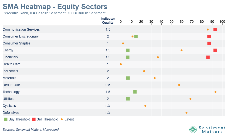
Now, all 53 aggregates are brought together in a single visualisation: the SMA Heatmaps.
It provides a quick overview of what is hot, what is hated and where sentiment is approaching levels that have historically mattered.
One example for Equity Sectors:
Why aggregate sentiment indicators?
There is no shortage of sentiment data.
Investor surveys, fund flows, positioning data, put/call ratios, implied volatility, ETF activity and many other indicators can all tell us something useful about investors’ mood and behaviour.
The challenge is that they do not always tell us the same thing.
At any given point, it is usually possible to find one indicator showing that investors are extremely bullish and another showing that they are deeply bearish.
That creates one of the biggest risks in sentiment analysis: the cherry-picking trap.
If we already have a bullish view, we may naturally focus on the indicator showing widespread pessimism. If we are bearish, the indicator showing excessive optimism is likely to attract more of our attention.
Both indicators may be valid. But neither necessarily represents the broader weight of the evidence.
This is why a systematic framework matters.
Rather than choosing the indicators that best fit the prevailing narrative — or our own view — the SMAs incorporate the full set of sentiment and positioning indicators available for an asset.
No single survey, flow measure or positioning series determines the conclusion.
The aggregate instead asks:
What is the overall message from the complete indicator set?
That does not eliminate judgement from the investment process. Nor should it.
But it does provide a more disciplined and less selective starting point.
Building the Sentiment Matters Aggregates
I have now built SMAs for 53 assets across all of the major asset classes covered by Sentiment Matters:
- Equity regions
- Equity sectors
- Equity factors
- Currencies
- Commodities
- Fixed income
- Broader Risk-On / Risk-Off sentiment
Each SMA is constructed from all the relevant sentiment and positioning indicators available for that asset.