
A question that comes up regularly in client conversations is not whether sentiment works, but when it works.
Most investors don’t operate on a single time horizon. They make decisions tactically over weeks and months, and strategically over longer periods. That raises a practical question: can the same indicators be used across both horizons, or do some work better short term while others are more useful over 6–12 months?
Understanding what a sentiment indicator is actually telling you is critical if you want to use it effectively. The same signal can mean very different things depending on the horizon you care about. Used well, sentiment can improve timing, risk management and position sizing. Without that context, it risks becoming noise.
The aim of this note is to make that more tangible. Rather than treating sentiment as a single, uniform signal, the focus here is on how individual indicators behave across time — where they add value, where they don’t, and how that changes depending on the horizon.
The Approach
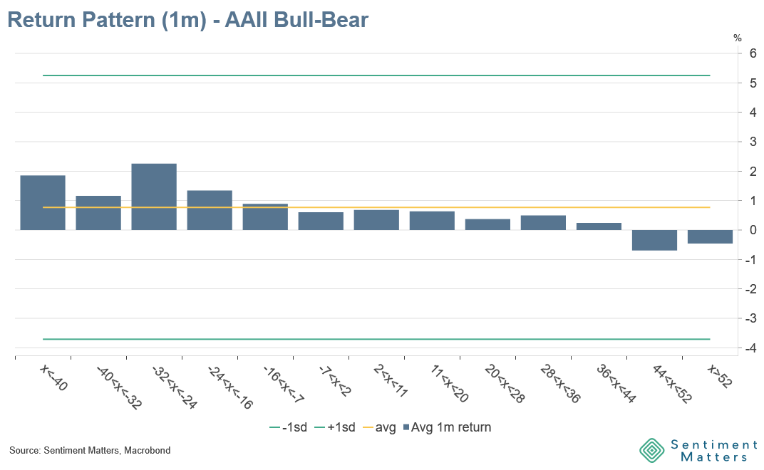
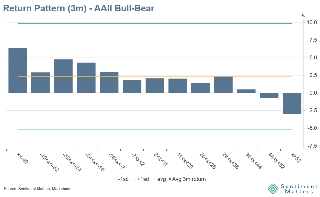
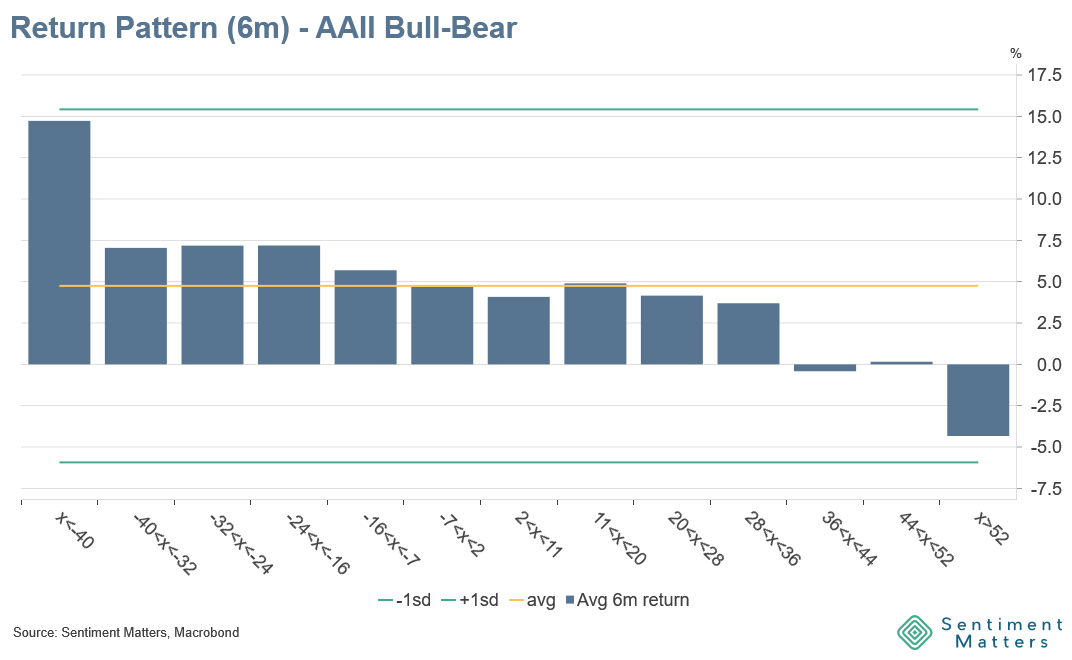
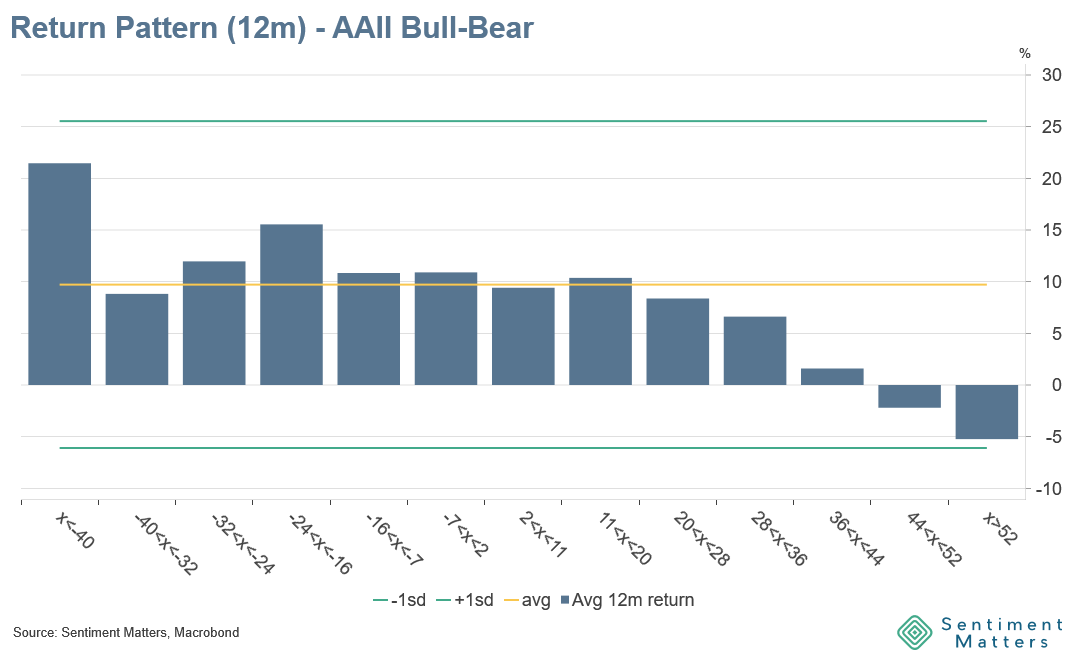
The starting point is straightforward. I tested 37 of the core Risk-On / Risk-Off indicators from the Risk Assets Heatmap across four horizons: 1, 3, 6 and 12 months.
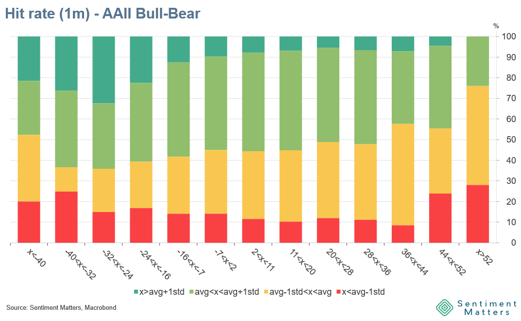
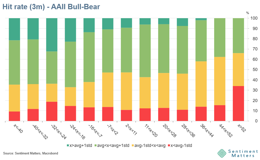
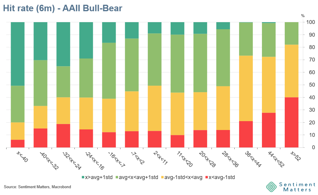
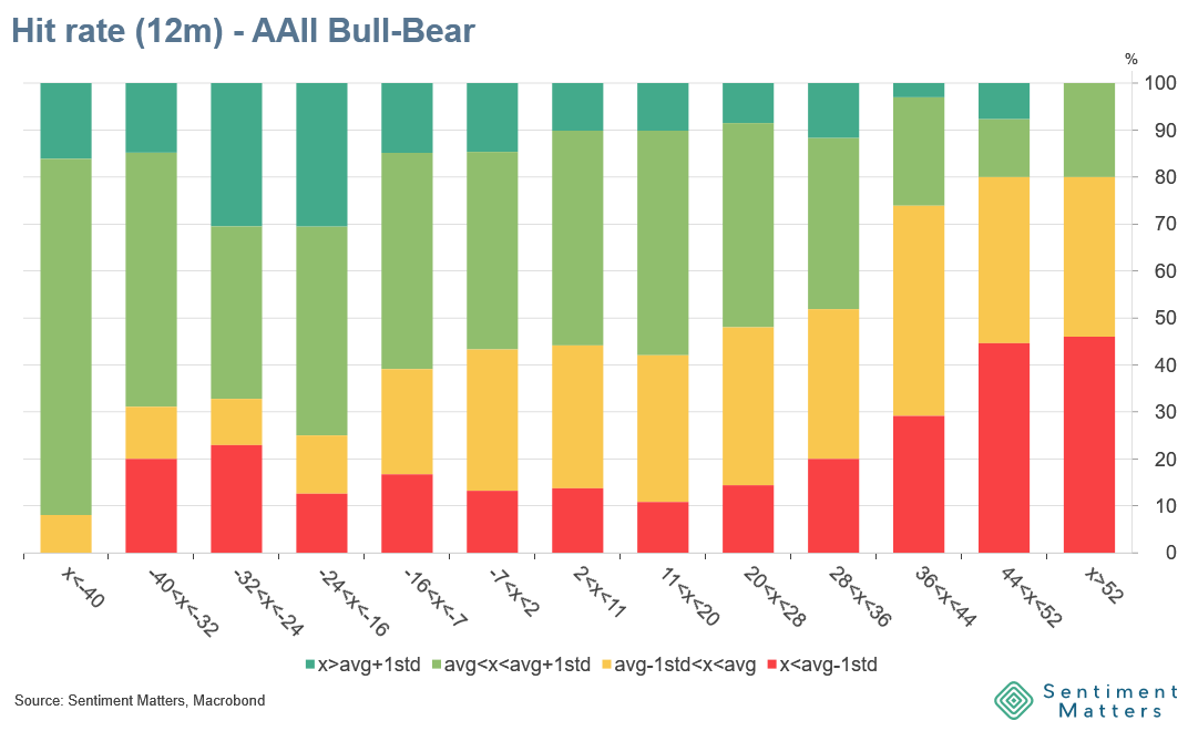
The mark of a useful contrarian sentiment indicator is that bearishness is followed by strong returns and bullishness being followed by poor returns. That is the pattern we are looking for.
For each indicator, observations are grouped into buckets based on sentiment levels — from very bearish to very bullish — and then matched with subsequent equity returns.
The first step looks at average returns. For each bucket, I calculate forward returns over each horizon and compare them with long-term average returns, as well as outcomes relative to ±1 standard deviation. This gives a first read on whether sentiment extremes are followed by meaningfully strong or weak return outcomes.
But averages can hide as much as they reveal. A few large moves can skew the picture. So the second step focuses on hit rates — how often the signal works.
For each bucket, I calculate the percentage of outcomes that delivered above-average returns, below-average returns, and more extreme outcomes. This gives a better sense of consistency. In practice, an indicator with a modest average return but a high hit rate can be more useful than one with a higher average but less reliability.
The final step combines both dimensions into a simple scoring system. Each indicator is assigned a score from 0 to 3 for each horizon, based on its return profile and consistency. Negative numbers denote indicators that show momentum rather than contrarian characteristics (e.g. bullishness followed by above average returns). The scoring is done separately for each horizon, which allows us to see how the usefulness of an indicator changes over time.