A quick note before the weekend to flag a new feature on the Sentiment Matters website: Live Charts.
With markets moving quickly, it’s all the more important to keep an eye on sentiment as the data shifts: what’s moving, what’s starting to look extreme, and what’s hitting historical buy/sell thresholds?
So we’ve added live versions of two of our most useful tools for big-picture risk appetite:
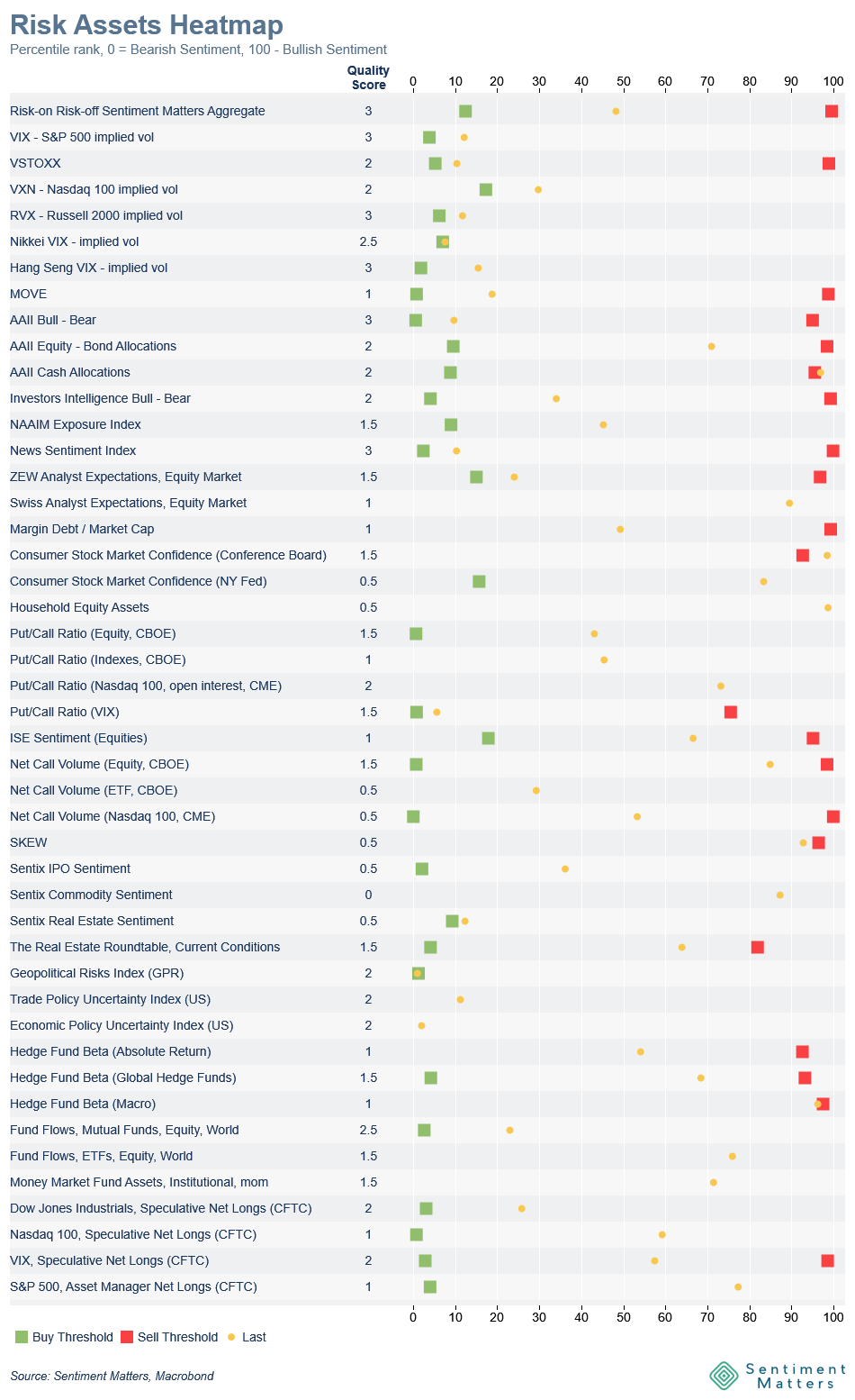
- the Risk Assets Heatmap, and
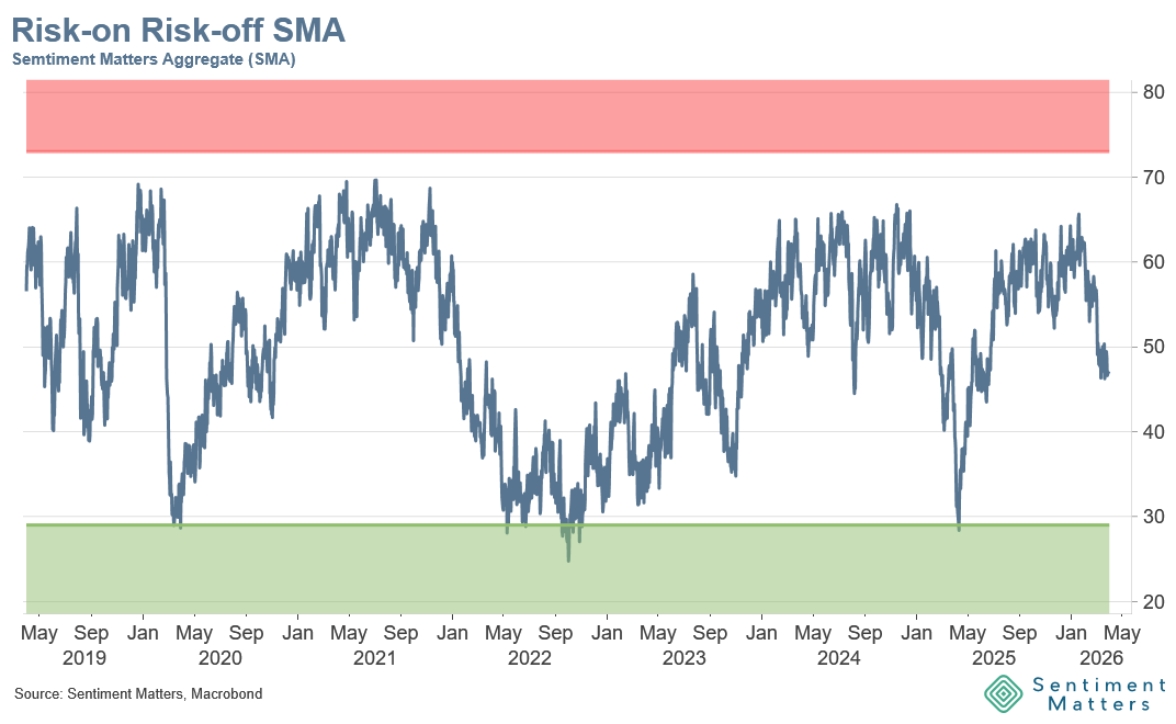
- the Risk-on / Risk-off Sentiment Matters Aggregate (SMA)
Both refresh automatically whenever new data becomes available, so you’re always looking at the latest read.
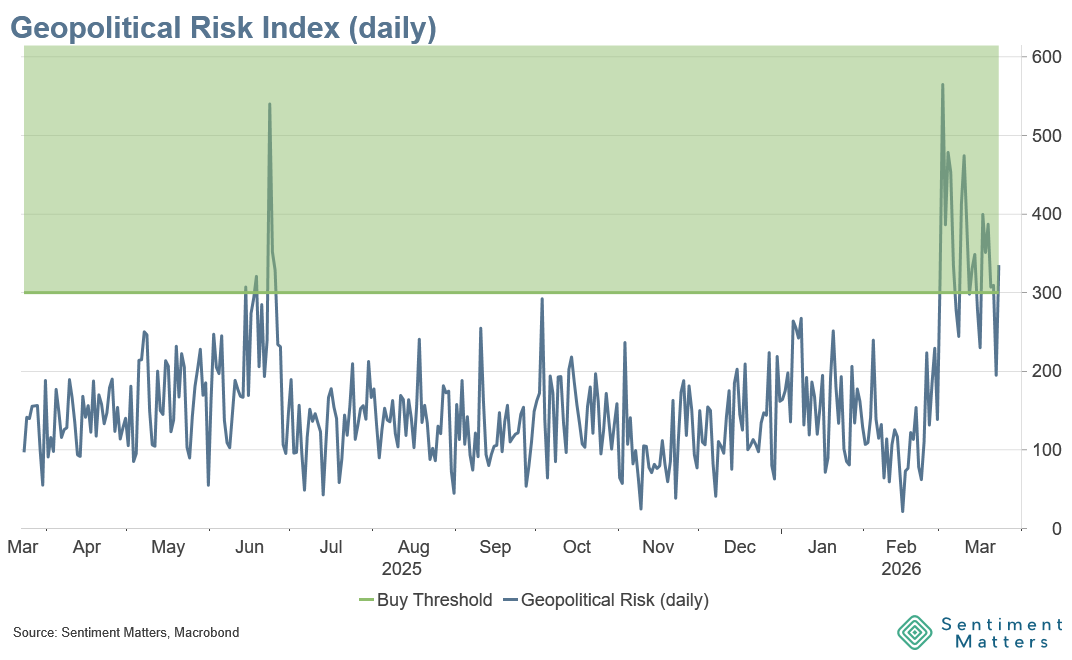
We’ll also feature one topical live chart. Right now it’s the Geopolitical Risk Index (GPR) — the best yardstick for the geopolitical risk premium (daily data, published weekly).
You’ll find Live Charts in the Toolbox section of the website (for subscribers).
This was directly inspired by client questions and requests, so if there’s something you’d like to see — or any feedback — just let me know. If it’s feasible, I’ll try to build it.
Have a good weekend & good luck,
Lars